Food for Thought.
Rebrand

Background:
Food for Thought is a zero-waste refill shop that aims to reduce plastic waste and minimise the use of chemical nasties in everyday products. After operating successfully for 2 and a half years, they decided to expand their customer base by launching an online platform. To facilitate this transition, they sought a rebranding effort to create a more engaging and reflective brand identity that resonates with their personality and promotes the ease of the refill process.
Research & analysis:
Food for Thought approached our team, in collaboration with our partners at Cult Marketing, to conduct research into other zero-waste and refill stores, particularly those with a strong online presence. To gain a deep understanding of Food for Thought's requirements and the challenges of their previous brand, we spent significant time with Kerry and Alice in their physical store. Through this process, we aimed to comprehend their unique needs and engage customers effectively in the conversation.
Solution:
Based on the research and insights gathered, our team developed a bold and playful brand identity. The primary objective was to represent the nature of the refill process while reflecting Kerry and Alice's outstanding and driven personalities. We developed a new brand mark that embodied the essence of the refill experience. The mark was complemented by a range of strong copy lines and graphic assets that support Food for Thought's digital journey.


Solutions Implemented:
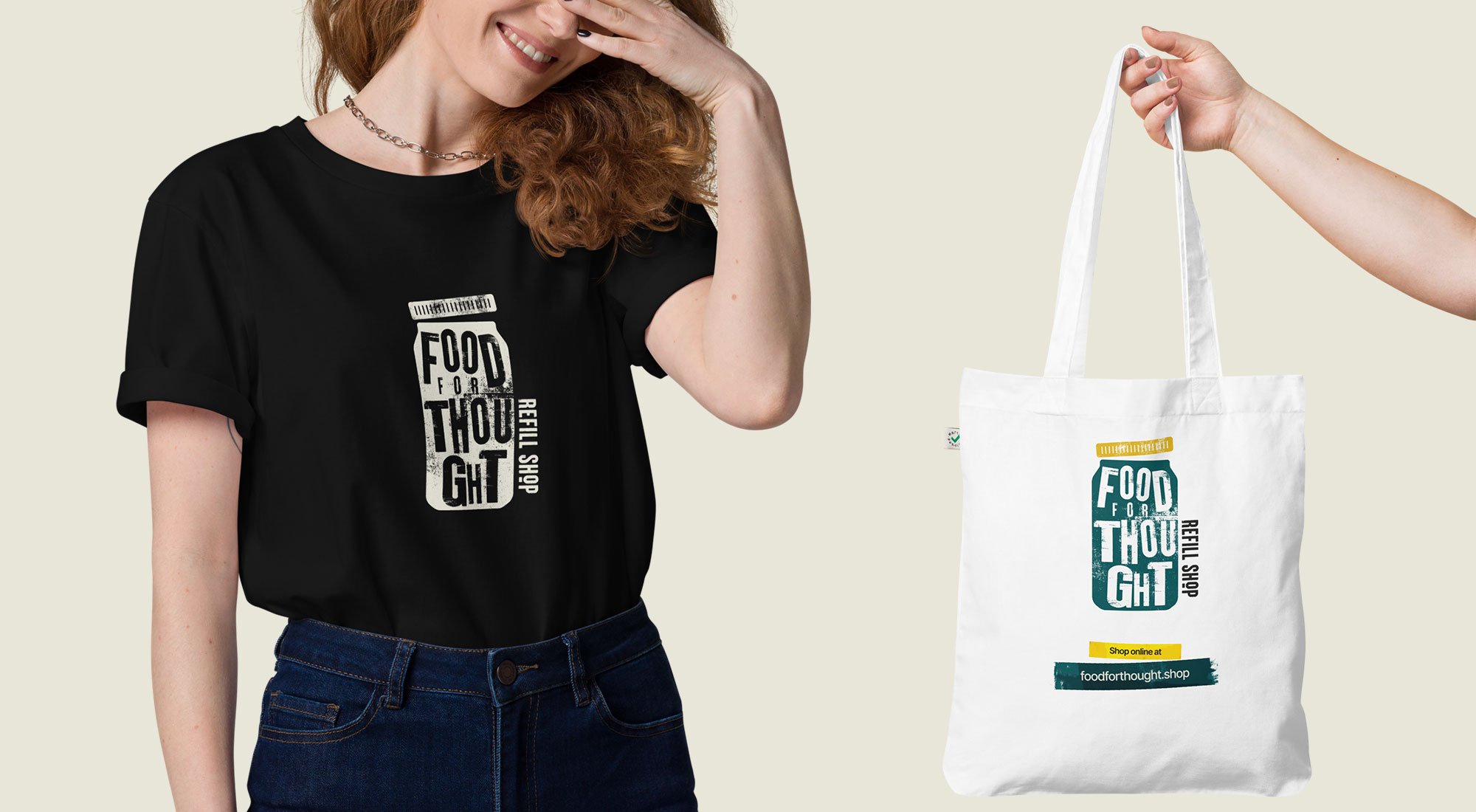
The rebranding process involved the creation of various brand assets, including a new brand mark, colour palette, typography, and supporting visual elements. The brand mark, designed to be eye-catching and vibrant, featured playful textures and typography that symbolise the re-use and refill process. We ensured that the brand identity communicated the shop's commitment to sustainability while conveying a sense of approachability and ease.
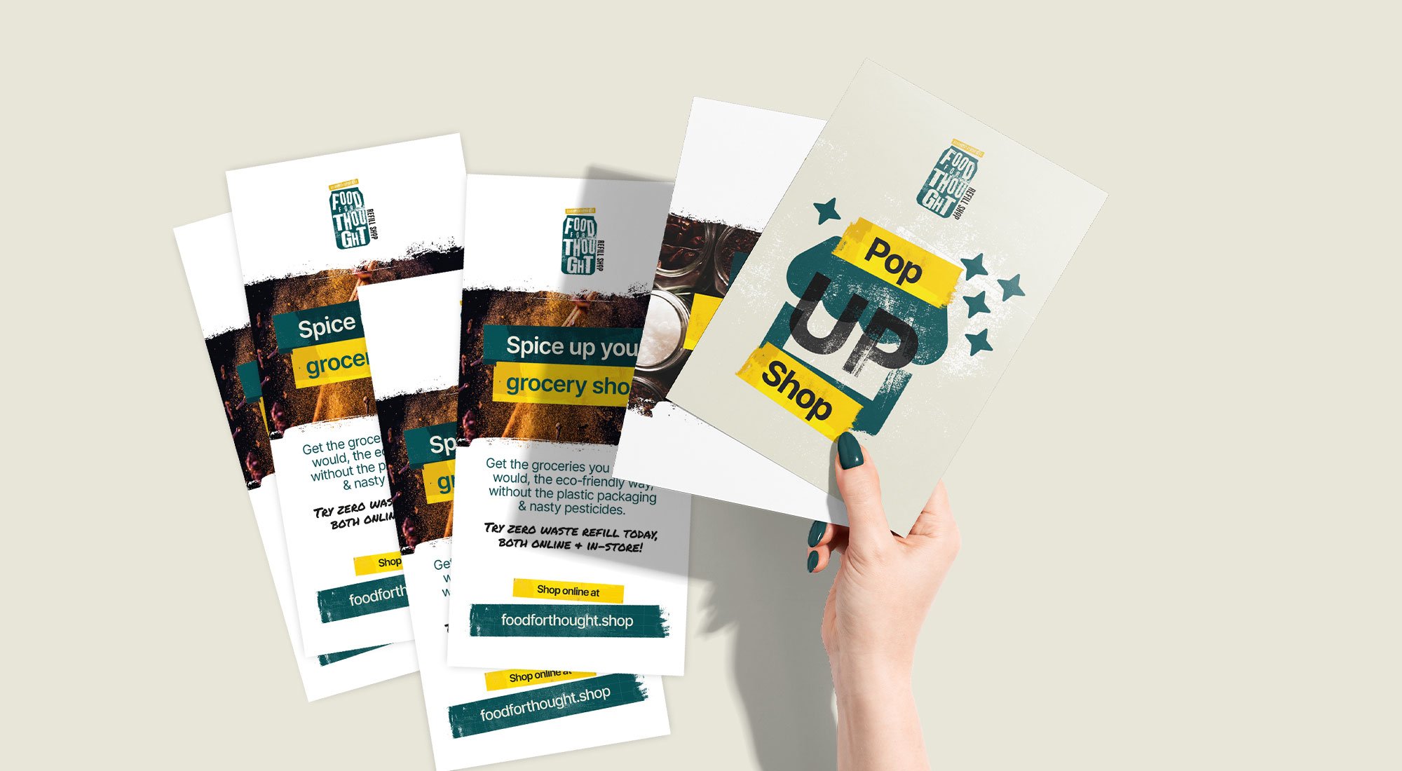
To implement the rebrand, we collaborated closely with Food for Thought's team, providing them with brand guidelines and training on how to apply the new identity consistently across their physical store and online platforms. This included building an online asset library of print and social media templates, graphics and typography all contained within Adobe Express. The marketing materials, both digital and print, were developed in alignment with the brand's new voice and visual style.
Outcome:
The rebranding initiative marked a new era for Food for Thought. The refreshed brand identity successfully captured the essence of their mission and personality, making the refill process more engaging and appealing to customers. The playful and bold brand mark resonated with the target audience and conveyed the shop's commitment to their 'More joy. Less waste' values.
Following the rebrand, Food for Thought experienced an increase in customer engagement and saw a notable expansion in their online presence. The brand's new digital journey, supported by the strong visuals and compelling copy lines, allowed them to reach a wider customer base beyond their immediate local area.
Overall, the rebranding project helped Food for Thought establish a distinct and memorable brand identity, facilitating their growth and positioning them as a leading zero-waste refill shop in the market.